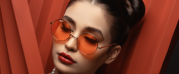
If you work as an adult cam model or independent content creator then you’re not just an entertainer, you’re also a brand manager. Your visual branding is the most immediate way to communicate your unique value proposition to your audience. Whether it’s through fan sites, webcam sites, Twitter, TikTok, personal websites, or custom content stores, maintaining visual consistency is key to crafting a recognizable and engaging brand. Here are some thoughts on how you can align your aesthetic across various platforms and ensure that your brand stands out.
Understand Your Brand Identity
Before you can ensure consistency, you need to clearly define your brand identity. What colors, fonts, and imagery represent you? Whether it’s sultry and mysterious or bright and bubbly, your aesthetic should reflect your content and personality.
As a great first step towards planning out your brand’s visuals, consider creating a mood board that combines your chosen colors, textures, and moods as a reference point. A mood board is a collection (and organization) of visuals that produce the emotional impact you’d like to associate with you. They can be made up of pictures or art or any other imagery that projects the right feeling for you and your brand.
The colors you choose are absolutely key to your brand, so choose them wisely. Colors elicit emotions and communicate messages without words. Select a palette that resonates with your brand identity and stick to it across all platforms. Consistent use of color will make your content instantly recognizable, whether on your OnlyFans thumbnail or your Twitter feed.
Create a Logo That Represents You
Yes, cam models and creators can benefit from a logo. Your logo is the cornerstone of your brand. It should be simple, memorable, and versatile enough to be used everywhere, from your webcam site profile to your email signature. Keep it consistent in style and placement across platforms, ensuring it’s visible but not overpowering your content.
Make your logo reflect your unique personality or niche within the adult industry — this could be through the aforementioned color choices, font style, or imagery. That said, it’s typically a good idea to avoid explicit imagery to ensure the logo can be used in a wide range of public and semi-public forums without violating platform rules or community guidelines. A good tip is to create a logo that hints at the adult nature of your brand without being overt, using subtle symbols or clever wordplay, which can entice the viewer’s curiosity and stand out in a crowded market.
Use Consistent Profile Imagery
Your profile picture is often the first thing a potential fan will see. Use the same headshot or logo across all platforms. This doesn’t mean you can’t update your picture, but when you do, change it everywhere at once to maintain continuity.
Use a high-resolution image so your profile looks professional and can be viewed clearly on all devices. Blurry or pixelated images can be off-putting and may suggest a lack of professionalism.
Also choose a photo where your face is clearly visible and well-lit, which will help you make a direct connection with your fans. A welcoming smile can make you seem approachable and friendly, giving fans more confidence to engage with you.
Harmonize Your Headers
Many platforms offer the option of a header or banner image. Use this space wisely to create a cohesive look. You can either use the same image across all platforms or different images that are stylistically similar.
The header should be a visual extension of your brand. Incorporate your brand colors, fonts, and any logos or slogans that you use. This helps to create a cohesive and recognizable brand image across all platforms.
Remember that each social media platform has its own recommended dimensions for header images. Ensure your header fits these dimensions perfectly to avoid important parts being cropped out or stretched. Use high-quality, visually appealing images that reflect the style and tone of your content. Professional photoshoots can yield striking images that capture attention.
If you include text, make sure it’s legible and not obscured by your profile picture or other interface elements. Keep text minimal – perhaps just your stage name or a short tagline.
Watermark Wisely
Watermarks serve a dual purpose: they protect your content and promote your brand. Your watermark should be subtle and placed consistently across all content, ensuring it’s visible without distracting from the main attraction.
Remember to use a consistent watermark across all your content. This could be your logo, brand name, or website URL. Consistency helps with brand recognition and makes it easier for your audience to find your content and distinguish it from unauthorized copies. The watermark should also be in a consistent position and size across all content to establish a professional and recognizable look.
Make sure your watermark has a level of transparency that allows it to be seen without overshadowing the content. It should also be opaque enough to remain readable and not easily removed through cropping or editing. A balance is crucial; a watermark that is too transparent can be easily ignored, while one that is too opaque can ruin the viewing experience.
More Thoughts on Brand Consistency for Creators
If you have a personal website primary or content store, this should be the epitome of your brand’s visual identity. They offer the most control over your aesthetic and should be the benchmark for your branding on other platforms. Consistent navigation elements, a harmonious color scheme, and high-quality graphics create a professional look that instills trust and loyalty.
When posting video content, remember to adapt to the platform. While visual consistency is important, so is platform optimization. For example, TikTok favors high-energy, vertical videos, while clips platforms often do better with high-definition, landscape format videos. Adapt your content accordingly, but keep elements like your color palette and graphics consistent.
Don’t fail to engage with your audience across platforms and pay attention to their feedback. Often, they’ll tell you what works best. Don’ take offense, but consider this a valuable opportunity to learn how others are seeing your branding. You are still the best judge of the image you want to project, so use helpful information to tweak your visual branding without sacrificing its core elements, and discard any feedback that isn’t suited to your brand.
Consistency is Key
Visual consistency should extend to the frequency and timing of your posts. Regular updates keep your audience engaged and help build anticipation for your content. Schedule your posts across platforms to create a rhythm that your fans can rely on.
That said, visual consistency across platforms is not just about looking professional; it’s about creating a memorable and immersive experience for your audience. As an adult content creator, your brand is your promise to your fans. It tells them what they can expect from you – excitement, connection, and content that’s uniquely yours. Align your aesthetic across fan sites, webcam sites, Twitter, TikTok, personal websites, and custom content stores, and you’ll build a strong, recognizable brand that stands the test of time and trends.


