Just when you think you’ve figured out how to work your Instagram account those pesky engineers can’t stop messing around and you’re stuck with another learning curve. Sometimes it’s no problem as they make small, easy fixes that you can wrap your brain around, or things that make the site better… but when they get it wrong… boy do they get it wrong.
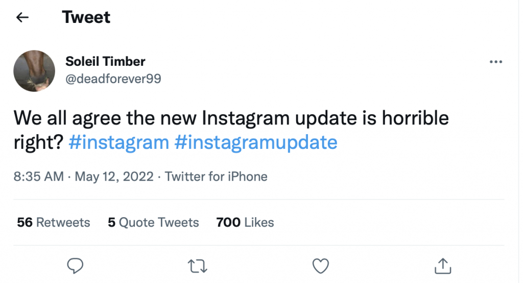
That’s what happened this past week after Instagram dumped a wonky new screen layout on unsuspecting users. As reported on by HTC, folks are none too happy and hundreds have taken to Twitter to read them the riot act.
As of this writing, this woman has 12 followers, that’s right TWELVE followers, and her post got 700 likes and COUNTING:
Most annoying, apparently, is the 9:16 bigger layout for both video and pics which has pushed the caption and likes to the top. Further, Instagram made a change to the algorithm which accelerates the content being suggested to users – they’re now getting more non-follower posts and videos being thrown at them than previously. I especially love the Brit who stepped into the fight with:
Why does this matter to you and your business?
As mentioned in my last article, algorithms that feed users new content (like yours) are helpful in getting new fans. But too much of a good thing is well… a bad thing. When the platforms dump too many outside videos and posts on peoples’ laps, they feel overwhelmed and pissed off. They’re being inundated nonstop and not even getting to enjoy their own followers.
Hey, Instagram! Slow the heck down! Don’t ruin a good thing for us creators!
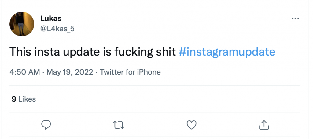
Let’s give a hand for Lukas who tells it like it is:
In addition, Instagram made a change to Stories.
Let’s say you’ve been a busy little bee and posted 100 Stories. Formerly your fans could easily watch those by tapping each one. But now, Instagram’s added an extra step by forcing the people who love ya to hit the button “Show All.” Nice, let’s make it harder for everyone to look at your content.
Instagram CEO, Adam Mosseri did say the change was just a trial run and assured that they were going to: “learn as much as we can over these next few weeks,” before they made it permanent. Okay, maybe everyone should calm down a bit. Let’s see how it goes. Meanwhile, if you don’t like the new update raise your voice on Twitter and put your vote in for flushing it down the drain!
—
Alyssa Collins hails from Minnesota, where snowy days were the perfect excuse to stay warm inside and write. Over the years, she turned that joy into a career and has authored numerous articles for various publications (under pen names). Email Alyssa via alyssa@ynot.com.
Photo credit: iStock.com/Pheelings Media


[…] photos and videos. The layout update in particular really caused a lot of ranting. In March, I covered the story which had users lighting up Twitter like a Christmas tree. As for the onslaught of suggested videos […]
[…] it’s been brewing for a while, complaints picked up steam in May when users blew up Twitter over an updated layout. Since then, their furor has mounted over being […]