Welcome back to Cam Tech-niques! In Part 1 of the series, we covered basic OBS watermarking. In Part 2, we’ll learn how to make a simple beginner level visual profile — no downloads required!
On some cam sites, you’ll have the option of customizing your profile to capture the attention of your viewers. This gives you a chance to make a unique presentation about yourself that’s colorful, stylish and a huge improvement from plain text. Visual profiles are popular because viewers are more likely to read through an image over a block of text — a well-done profile could thus increase your earnings.
If you work on a site that allows for visual profiles, you should definitely take advantage of it.
You’ll know if you can create a visual profile on a site if you can edit the Hypertext Markup Language (HTML) in your profile settings. This just means you can use the HTML computer language to edit the web page, just like the MySpace days. Chaturbate, MyFreeCams and NiteFlirt are a few popular sites that allow for HTML editing. If your cam site doesn’t have HTML profile editing you can still use this tutorial to make creative graphics for social media self promotion.
First Impressions: Prepare Your Profile
Before a profile is made, it needs an outline to give it direction. I recommend your profile has the following information, in order of appearance:
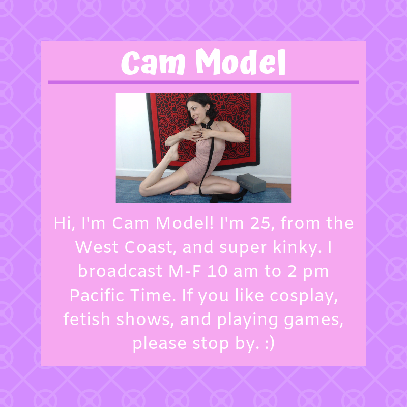
Information About You – a short summary about you and your shows
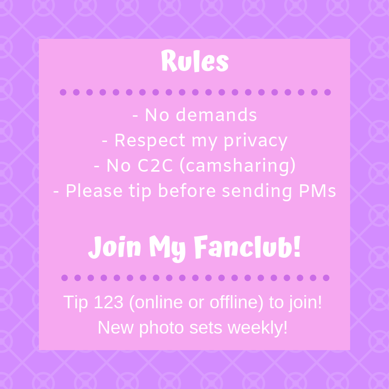
Rules – a short list in order of importance
Call to Action – a statement telling the viewer to support you
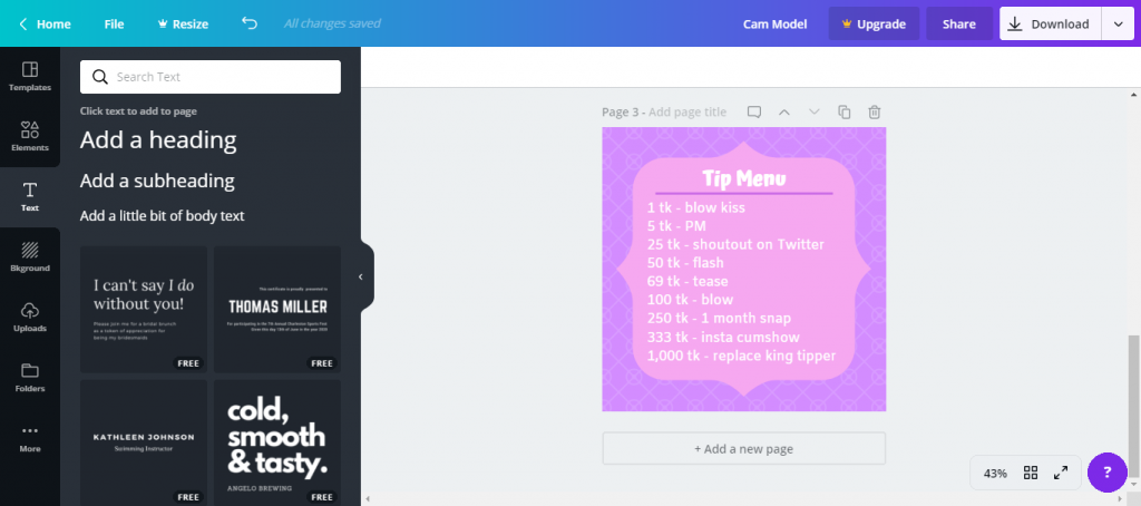
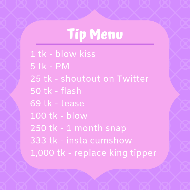
Tip Menu – a menu of services and rates for token sites
If you are making a graphic, I suggest making as many as you want to bring fresh visuals to your social media accounts. Some examples of graphics you could make are:
Having a sale or a promotion (15% off all videos)
Announcing something (“Thanks for 1,000 followers!”)
Spicing up a bland account (posting “I’m online now” in visual form with a photo of yourself)
Your on-site profile or social media account is your chance to make a big first impression on your audience, so spend some time writing out the information that you’ll plug into your creation. Even if the final image looks great, the words are the most important part — be concise and write from your heart.
Tutorial
Our profile will contain three separate images appearing one after the other in a column. They will all be created in the same way. Image One is the about me, Image Two is the rules/call to action and Image Three is the tip menu.
The only difference between a visual profile and a media graphic is the content. So although there won’t be a step-by-step tutorial for the social media graphic, the following steps will enable you to make one. This is a creative process, so have fun and make it yours!
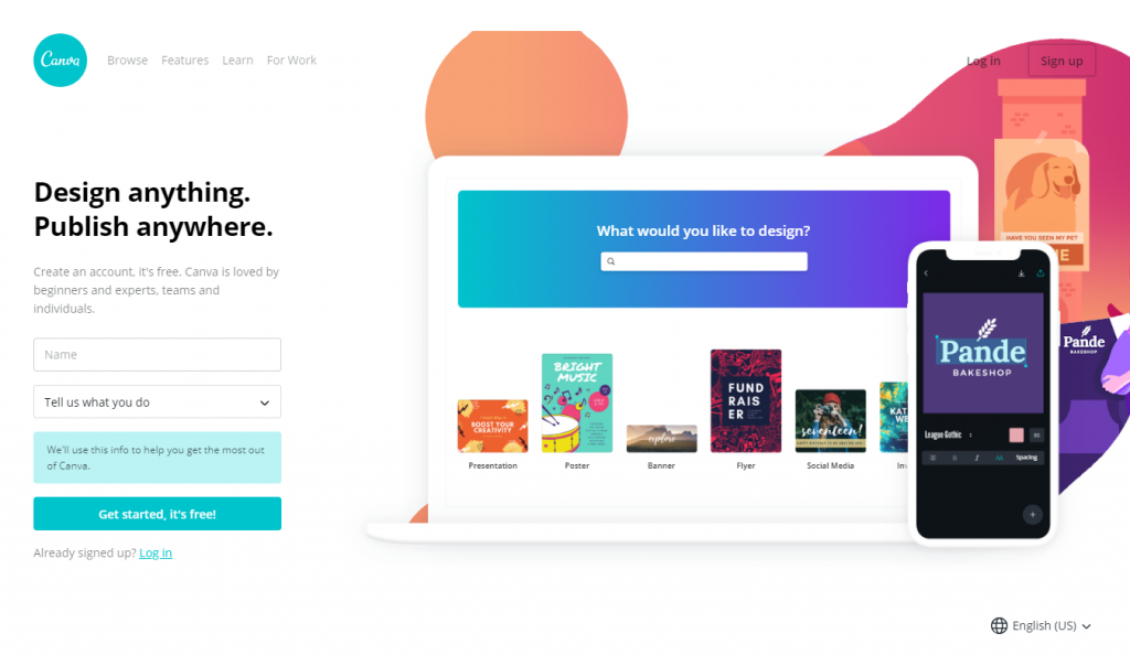
Step 1. Go to canva.com and create a free profile
For this tutorial, we’ll use a popular program called Canva. Visit Canva.com and create a free profile. It will ask for you to input your name and information about what you do. I selected “Small business (startup, blog).”
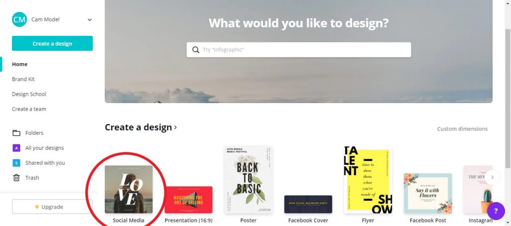
 Step 2. Create a Design (Start making your profile)
The first time you use Canva, a screen will pop up prompting you to start your first design.
Find a template that is 800 pixels by 800 pixels or exit the screen and select the blue “Create a Design” button from the top of the left sidebar. Find “Social Media – 800px x 800px” (circled in red) and click on it. This will be the size we use for our profile and social media graphics.
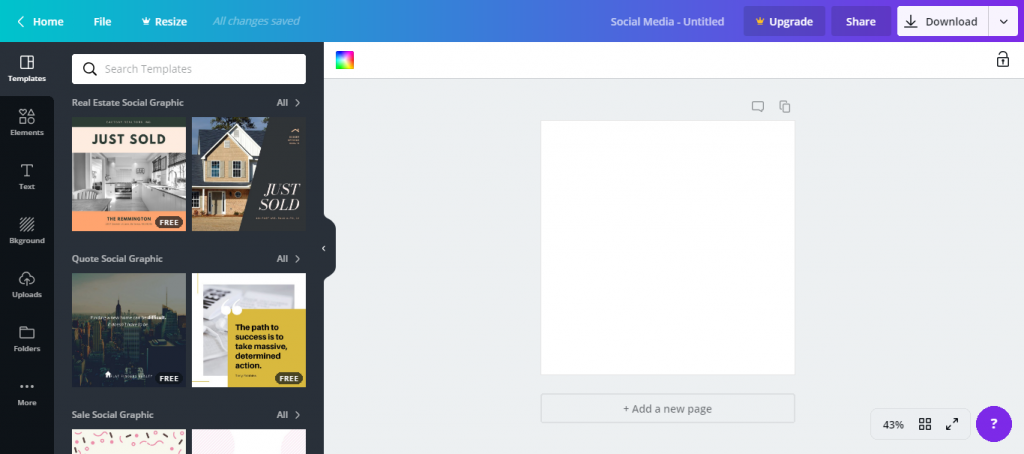
Clicking on the social media button will bring up a new window where the designing takes place. There’s a plethora of templates, a blank image ready to be worked on and many tools available.
Click around a little to get familiar, then move on to the next step.
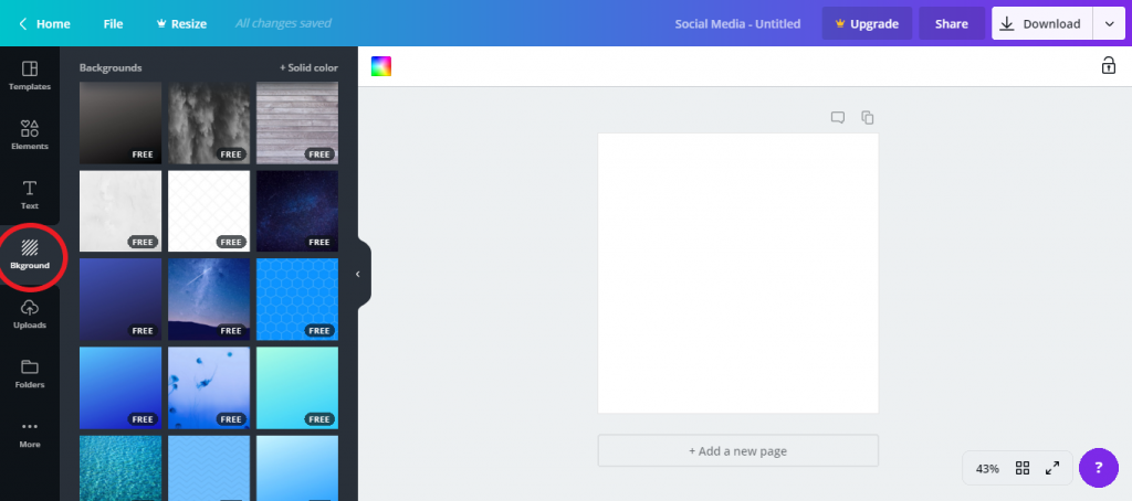
Step 3. Create a Background
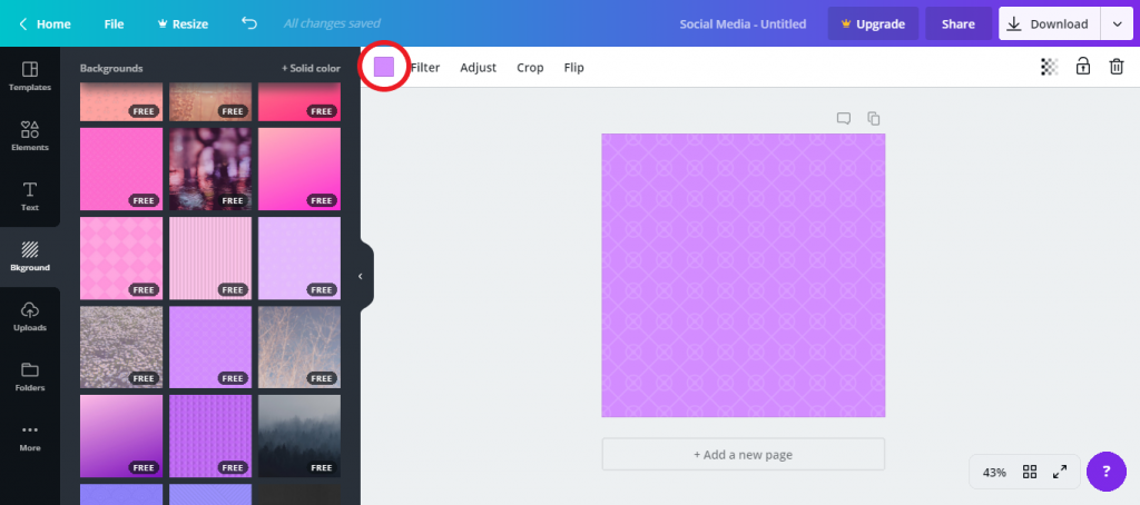
From the far left sidebar, click on “Bkground” to bring up the background menu.
You’ll find a lot of free background images and the option to open up a color palette. It’s your choice to pick a solid background color or a free background image. I picked something I liked and will add a text box to it next.
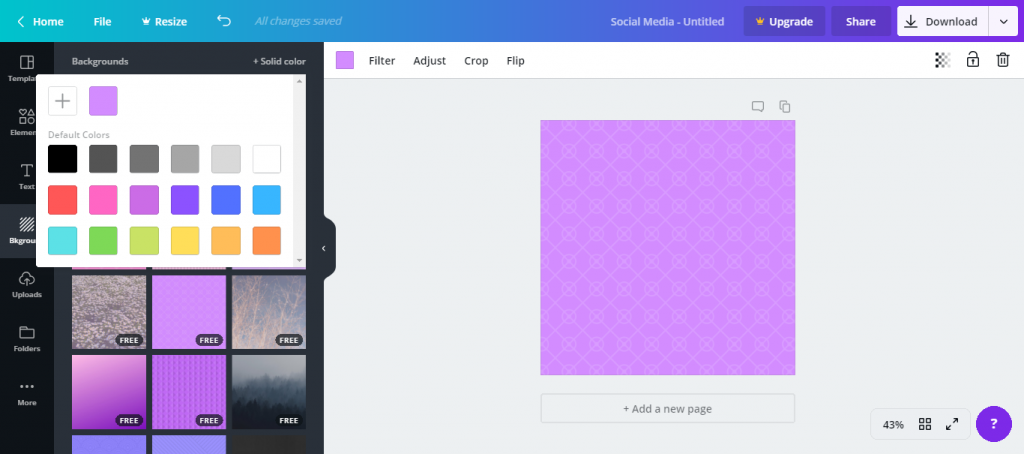
Circled in red (below) is a small purple box. When something is selected in Canva, use this box to change the color of it.
I am using a patterned, pre-made background, but you could select a solid color from here instead for your background. We will be clicking on that box often to change colors during this tutorial.
Color change that box!
Step 4. Add Text Box to Profile
From the far left side bar select “Elements” and scroll down to find the square under the sub header “Shapes.” Clicking on it will automatically center it onto our image.
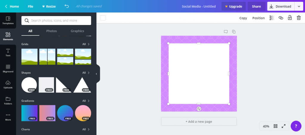
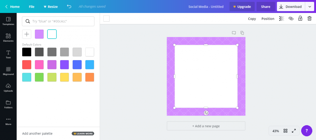
Clicking on the text box — the blank square we just added — will allow us to edit the properties.
I opted to make the text area a light purple shade by clicking on the previously mentioned square in the top header bar. To divide the text box into sections, in “Elements →All,” find the free line under “Lines.”
Work that box!
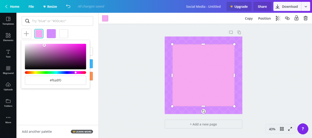
Click the line once to add it and move it to the top of the text box so that there is a divided area to put the header.
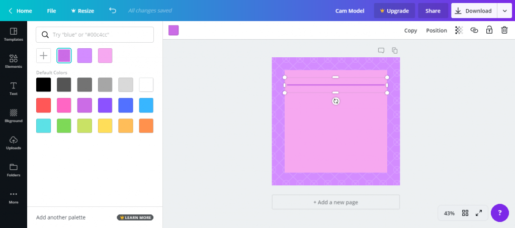
To edit the line click on the square in the top bar to change the color. When the line is selected you can also adjust the size by expanding or minimizing the border. I colored it dark purple and made it a little bit smaller.
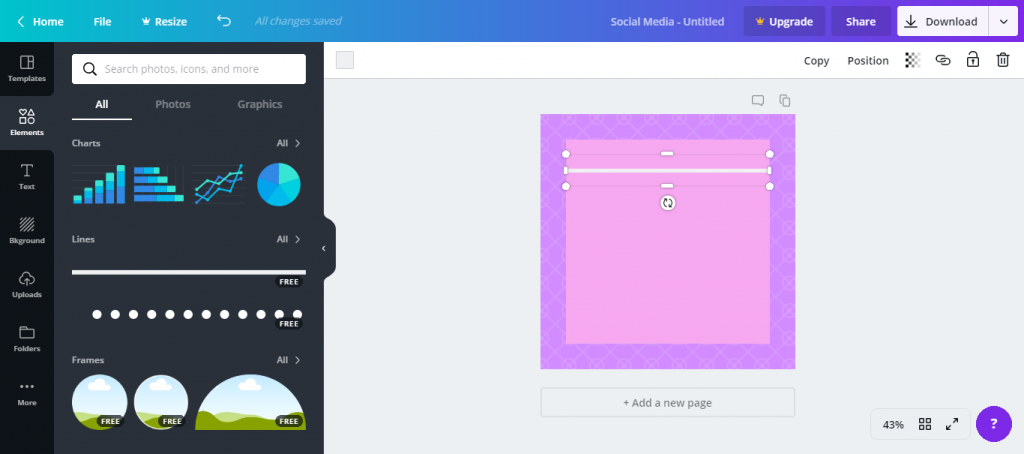
Progress happening!
Step 5. Add Text
Now it’s time to start adding text to your image.
From the far left side bar select “Text” and then click “Add a heading” from the menu that appears. Move the heading to the top part of the text box, above the line.
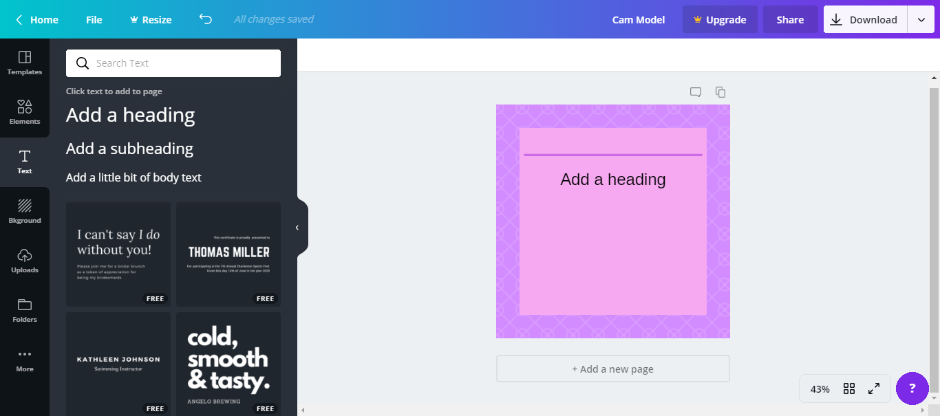
More progress happening!
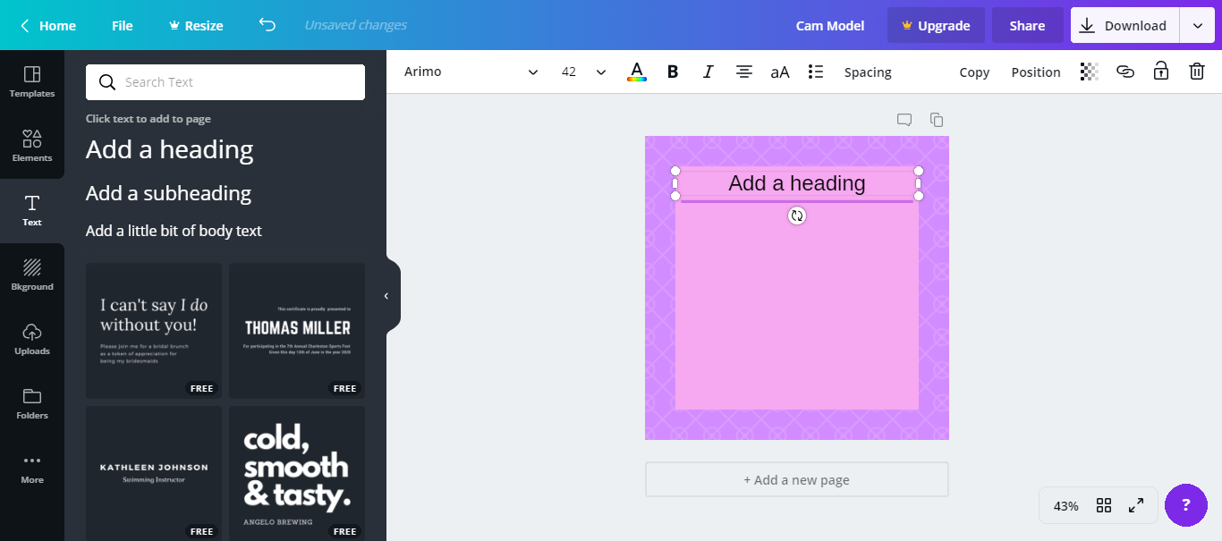
Click on the text, and edit it however you’d like.
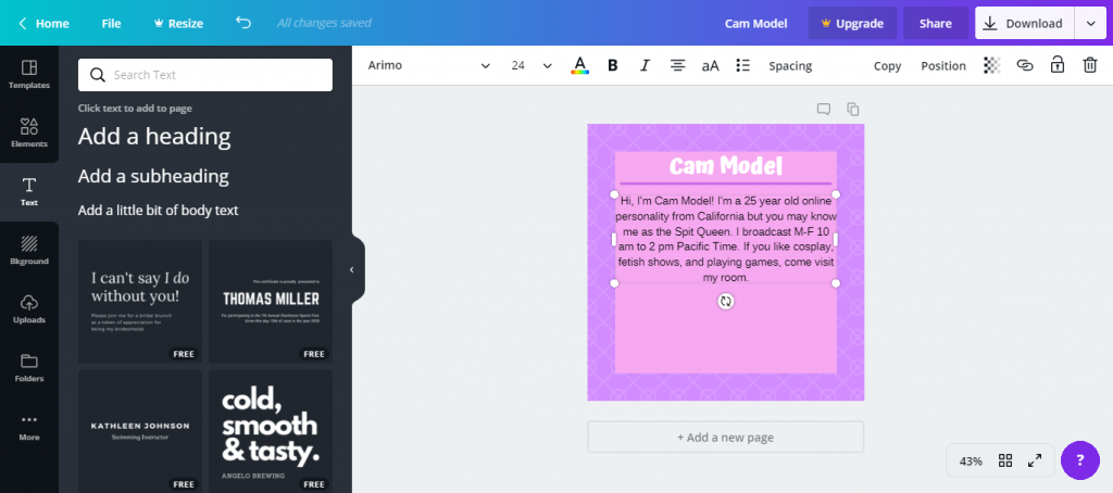
Using the top bar, I changed the font, color and size of the text. Using the same steps, I added a mock bio by selecting “Text” and “Add a subheading.” I typed out my information and changed the font size, font and color again.
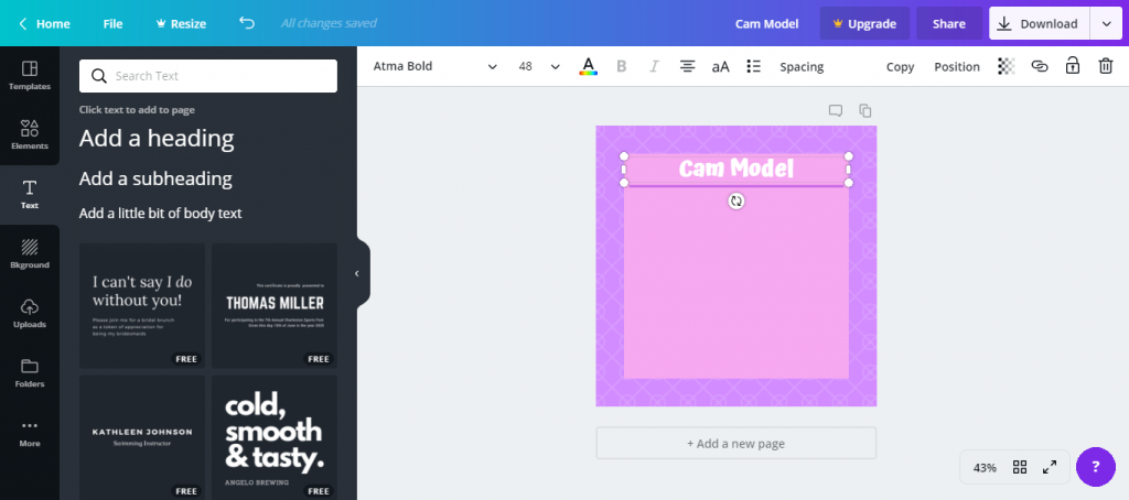
Make you bio read whatever you want!
Using my cursor I moved the sub header text box to the bottom. Next, I selected “Uploads” from the far left sidebar and uploaded a photo of myself. Clicking it once places it over the image being worked on, and again I used my cursor to resize and align it under the header. Now the first image is complete.
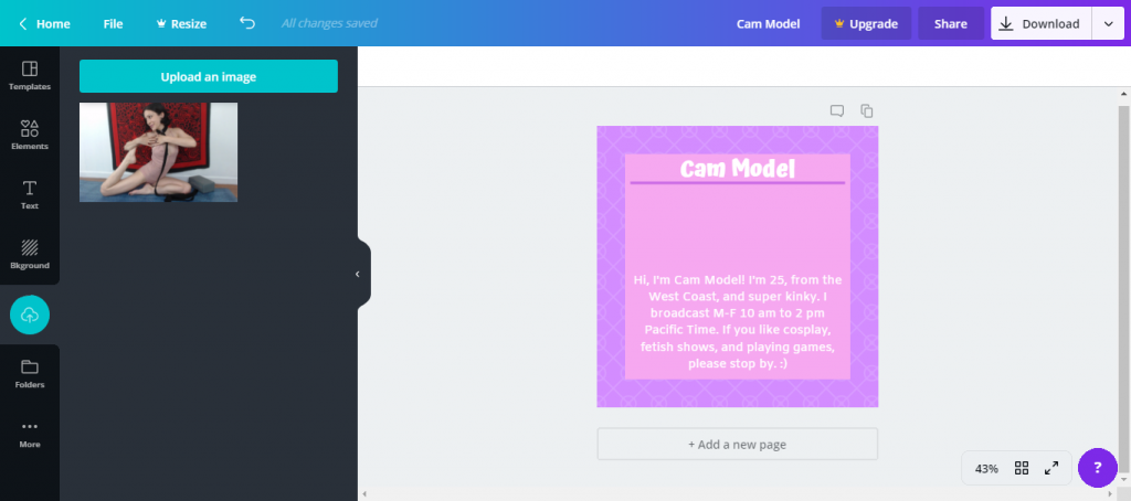
It meee!
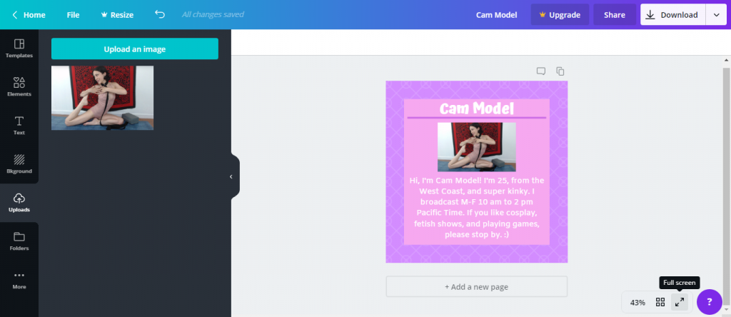
Canva has useful alignment tools that appear as grid lines in your image when you move a component. This helps you align text boxes and other elements to each other. You can also change the spacing and alignment of your text too using the top bar, like in Microsoft Word.
Step 6. Repeat the Process For Each Image
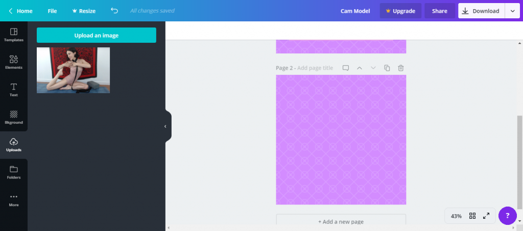
The same rules apply when making more images!
Below the image you work on in Canva is a tab that says “+ Add a new page.” Selecting this brings up a blank image with the same background as chosen before.
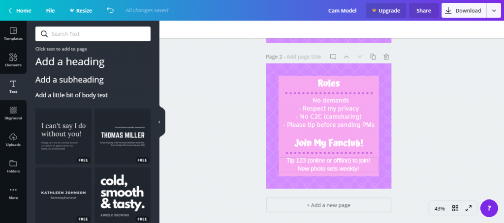
To make another text box, go to “Elements →Shapes →Square” and add it to the image. Change the text box color and add other elements like lines and different text types to write out your rules.
If there is leftover space at the bottom, put a call to action, like “Join my fanclub” or “Buy my videos below.” Repeat this process again for your tip menu.
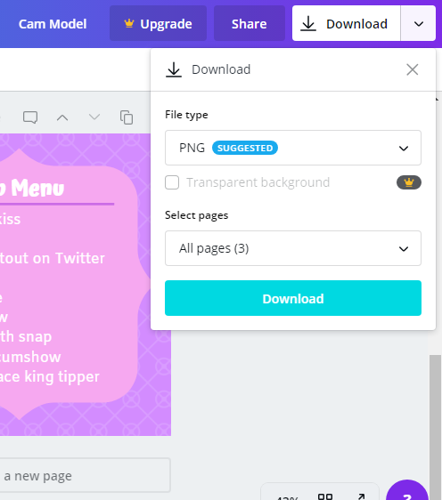
To download your images, click the “Download” button in the top right corner. Choose “Download” once more from the drop down menu and “PNG” as the file type.
Ensure all of your pages are selected and click the blue download button. It will download as a compressed file which you’ll need to extract to host online.
Step 7. Upload Images to Image Hosting Site
The next step is to host your images somewhere.
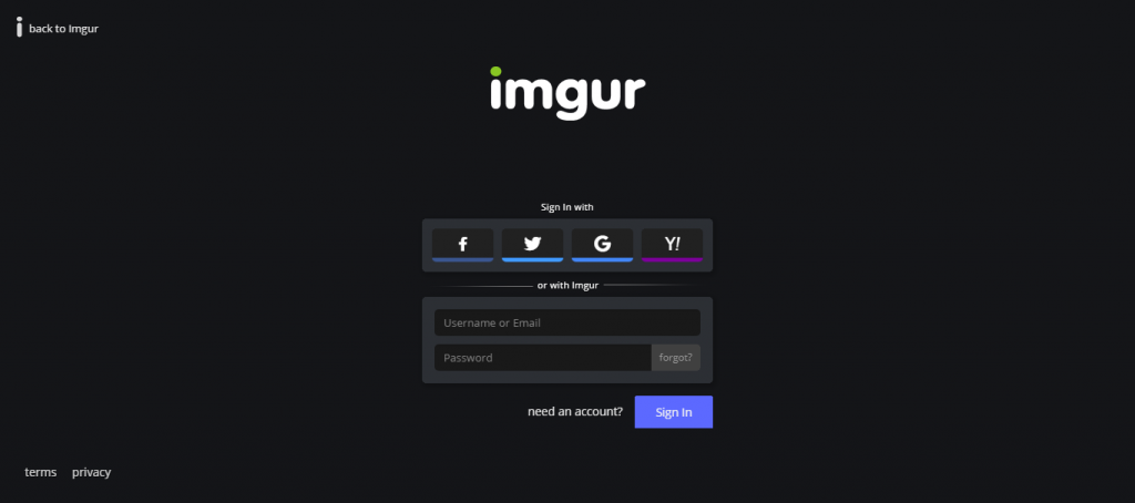
Extract them from the compressed folder and name them for reference. I recommend hosting on Imgur, but you can host your images any adult-friendly place you prefer.
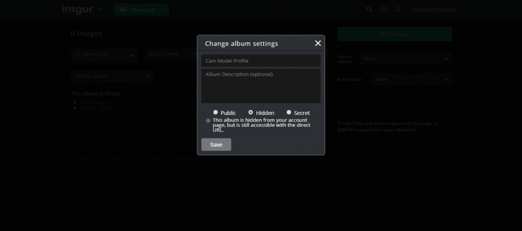
On Imgur, upload your profile images into their own album then set the album to hidden so no one can access the images from the Imgur site.
Some Imgur for you!
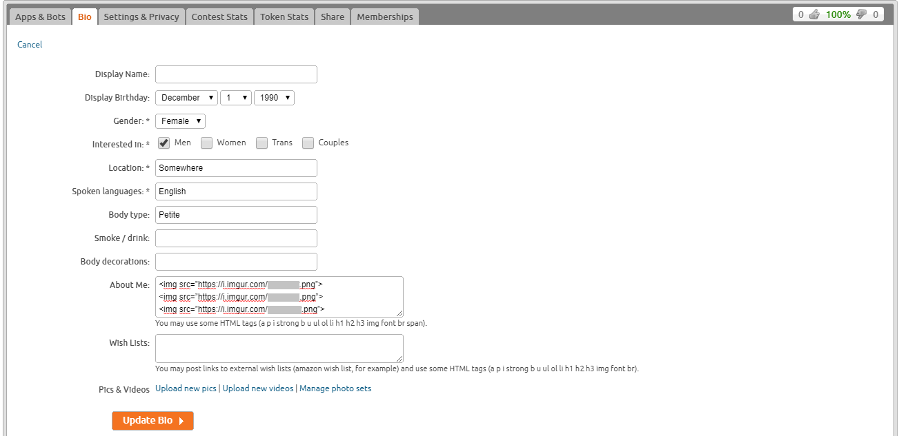
Step 8. Paste Images Into Profile With HTML
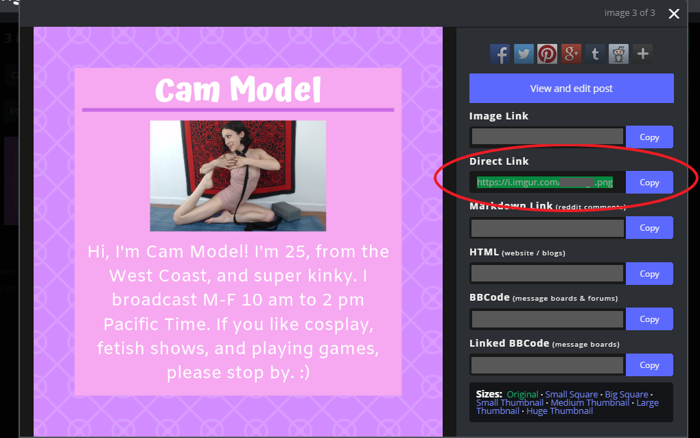
Log into the cam site where you want to display the profile you just made. Find the where you can edit you information and add HTML, and use the following code to paste the pictures from the hosting site into your cam site.
Copy and paste the text below, but replace the direct link between the quotes with one to your image. It should end in “.jpg” or “.png.” This is found on the details of each image that you upload to a hosting site.
<img src=”http://imgur.com/link-to-your-image.jpg”>
Code looks scary, but it isn’t!
Now you’ve got a graphic profile that you worked hard on!
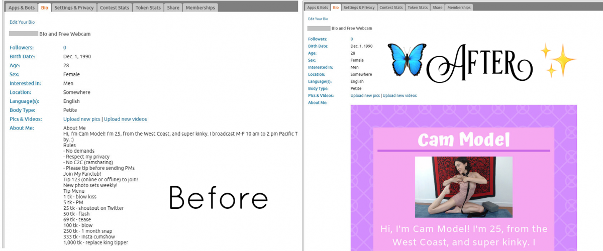
It should appear similar to the example shown below. Although your viewers will have to scroll down to see the rest, they will be drawn in by your fancy profile which will tell them more about you. Use it to your advantage! When members ask repeat questions, you can now direct them to your profile for the answers.
Here’s the same text versus visual that appears in the post header to remind you of the difference — it’s huge!

…and here are the full images I made as part of this tutorial — in their full glory for you to see You can do this now too!
Profile:
Tips:
Rules:
What program do you use for online graphic making? Hit us up on Twitter if you tried this tutorial and have feedback or just want to discuss tech tips!
—
Anouk Gilmour is a registered yoga teacher at the 200-hour level. Eight years after trying camming in college, she is an amateur adult model again. Find her on Twitter at @anoukgilmour.
All screenshots and media created or modified by Anouk Gilmour.



[…] programs, then you know what to do. If you’re starting out, try following the guidelines in an article I wrote earlier this year about creating a visual profile. Once you’re familiar you apply the same guidelines to make graphics with backgrounds that […]
[…] our previous Cam Tech-niques series, we showed you how to use Canva yourself. specifically, we went in-depth on how to create a visual […]