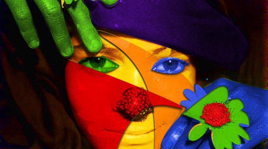
Color psychology can play an important part in branding, especially in the fashion and entertainment industries, where images and design are stock-in-trade. Understanding color psychology can help you be a more effective marketer.
Any model with a moniker that’s color-related should consider clever ways to use it to create recognition online. #duh Using color to create your personality helps you express yourself visually online, plus it’s something fans can identify quickly.
If your website needs a makeover, color can be key. Studies show that little color tweaks can lead to conversions just by using a lighter background or adding a pop (up) of color where you want fans to go. Marketing consultant Shane Barker gives some solid tips on how to pimp your site with color.
Red, orange, yellow, green, blue and purple compose the color spectrum seen by the human eye. Secondary colors include red-orange, yellow-orange, yellow-green, blue-green, blue-violet (aka purple) and red-violet. All other colors are a blend of those true colors. Things get way more complicated than that, but we don’t need to go there.
Each color is associated with emotion and symbolism, which can vary by country and culture. Some colors have been shown to have subliminal effects on human behavior.
For instance, why do you see lots of red in restaurants? Because red is a stimulating color that encourages hunger. It’s the color of blood, like on a juicy steak (sorry, vegans). Of course, it’s considered a sexy color, again because it revs you up a little — and it’s the color of hearts.
Other color meanings:
- Orange: sunshine, happiness, energy, warmth (think pumpkin spice or a hot June day at the beach).
- Yellow: intelligence, light, optimism.
- Blue: trustworthiness (hence, many businesses choose blue branding), stability and calm.
- Green: nature, money, environmental, health.
- Grey: represents neutrality but also can be depressing and gloomy for some people if they’re in a grey environment for too long. #Seattle
- Brown: organic, earthy, solid, chocolaty.
White and black are not colors, technically, but both are symbolic of many things. White represents purity, grace, elegance and simplicity. Black is associated with formality, edginess and all things Goth and darkness, of course.
Pink, an all-time favorite for “feminine” product marketing, stands for everything sweet, from Barbie’s Playhouse to strawberries.
Pepto-Bismol is pink, too. Researchers dubbed it “drunk tank pink,” but in studies, rowdy drunken inmates placed in a Pepto-Bismol pink holding cell reported feeling calmer for the first 20 minutes or so. Then, several of them grew nauseous, as if the environment had become sickeningly sweet (or maybe it just reminded the inmates of stomach aches related to Pepto-Bismol). Eventually, the inmates became more violent the longer they were in there.
Purple, considered another sexy favorite, also represents wealth, royalty, exotic-ness (think of a tropical orchid), sophistication and mystery.
Jewel tones, metallic silver and gold convey luxury, royalty, tradition or a sometimes-conservative sense of style, (as seen in classic designer brands like Ralph Lauren and Hermes). Dommes and BDSM sites do well in these, because the rich colors give off a sense of superiority and dominance.
So, does that mean if you’re a domme, you can never wear a sunshine-yellow patent leather corset with matching thigh-high platforms and cosplay wig? What fun is that?
If you’re going to rock an all-yellow outfit, do it like a superhero, not like the frozen banana man at the county fair. When you’re trying to stand out, effective use of color is a tool to attract eyeballs to your uniqueness.
“…(N)early every academic study on colors and branding will tell you that it’s far more important for your brand’s colors to support the personality you want to portray instead of trying to align with stereotypical color associations,” according to Entrepreneur magazine.
In other words, “taste the rainbow.” It worked for Skittles.


